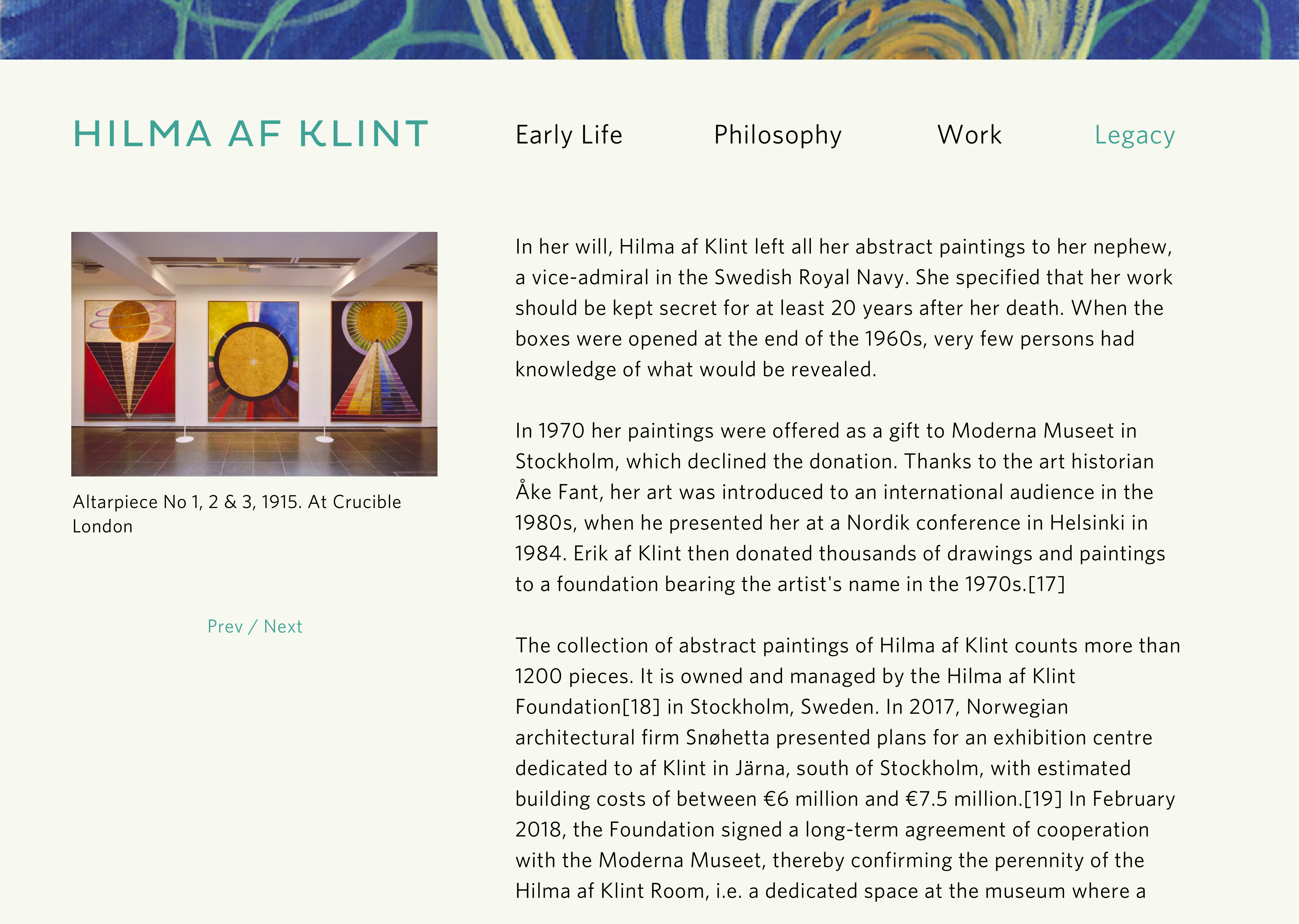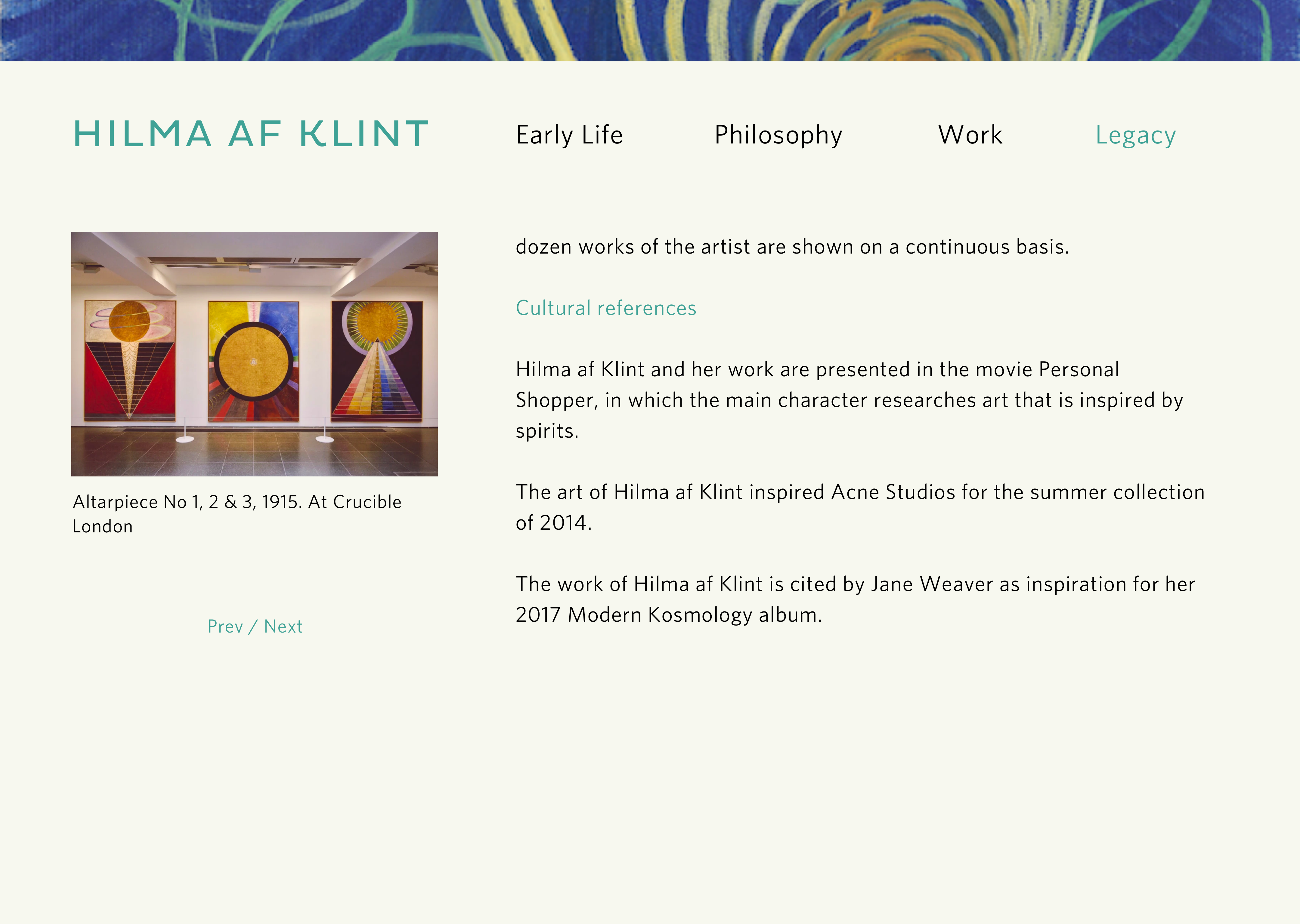
Miles Lee / Interaction Foundations / Microsite Mockups
Creative Director: Alec O'Brien
Designer: Miles Lee
Overall notes:
Directions from Alec:
Feeling of lightness or airiness. Hilma was heavily involved with mysticism and would have seances with other artists. Sans serif type? It’s historical (late 19th/early 20th centuries, yet it is also modern work).
Header initially takes more room (shown in 1st screen). User can press "enter" or scroll down to see the 2nd screen.

Directions from Alec:
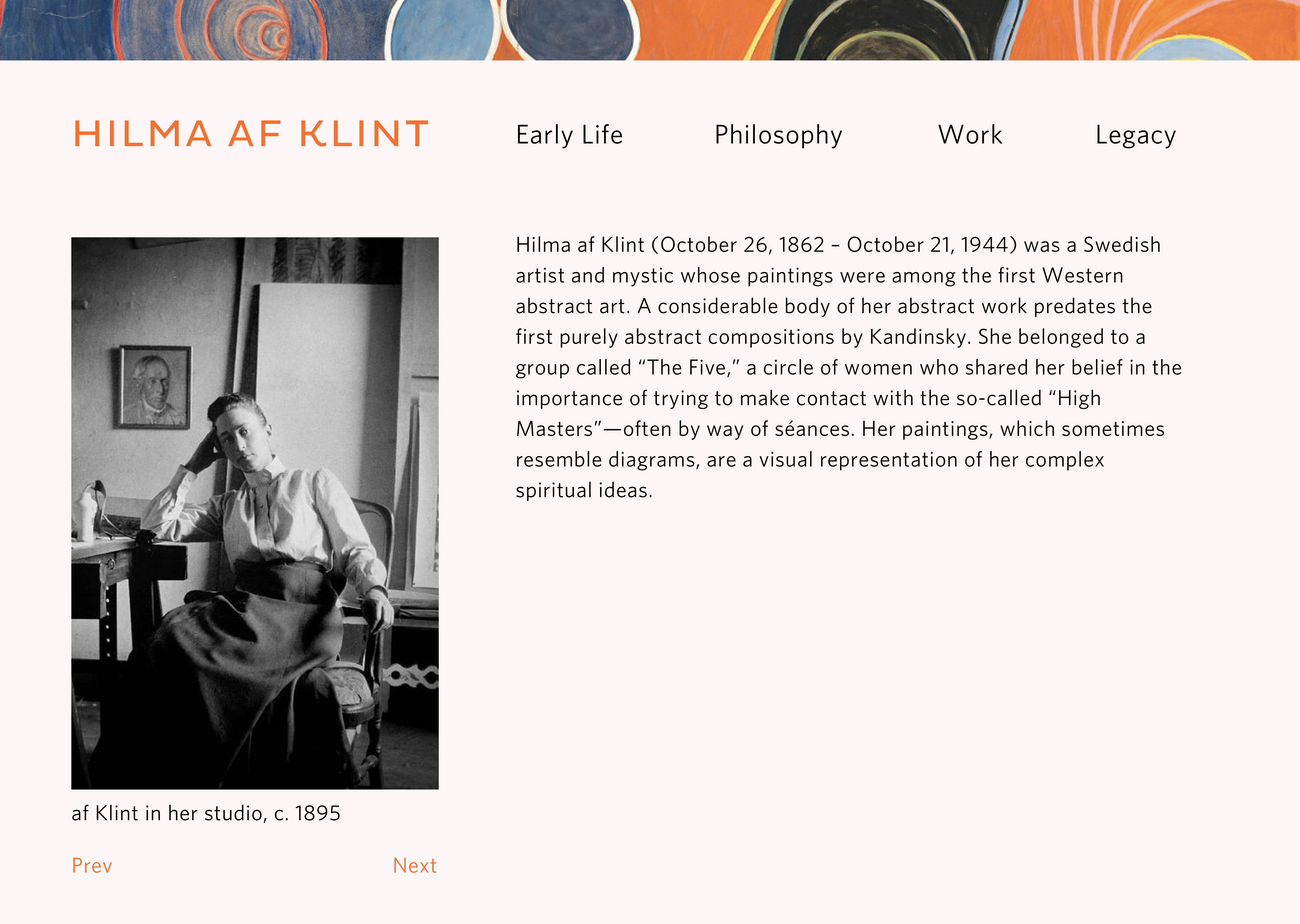
Pleasant, upbeat mood. Related to outdoors and water: greens and blue would probably be appropriate
Header painting is another one of her early works. Other images on this page (can be seen by clicking "Prev" and "Next" in the real thing) will be her other early works. Not sure how many to include.
Directions from Alec:
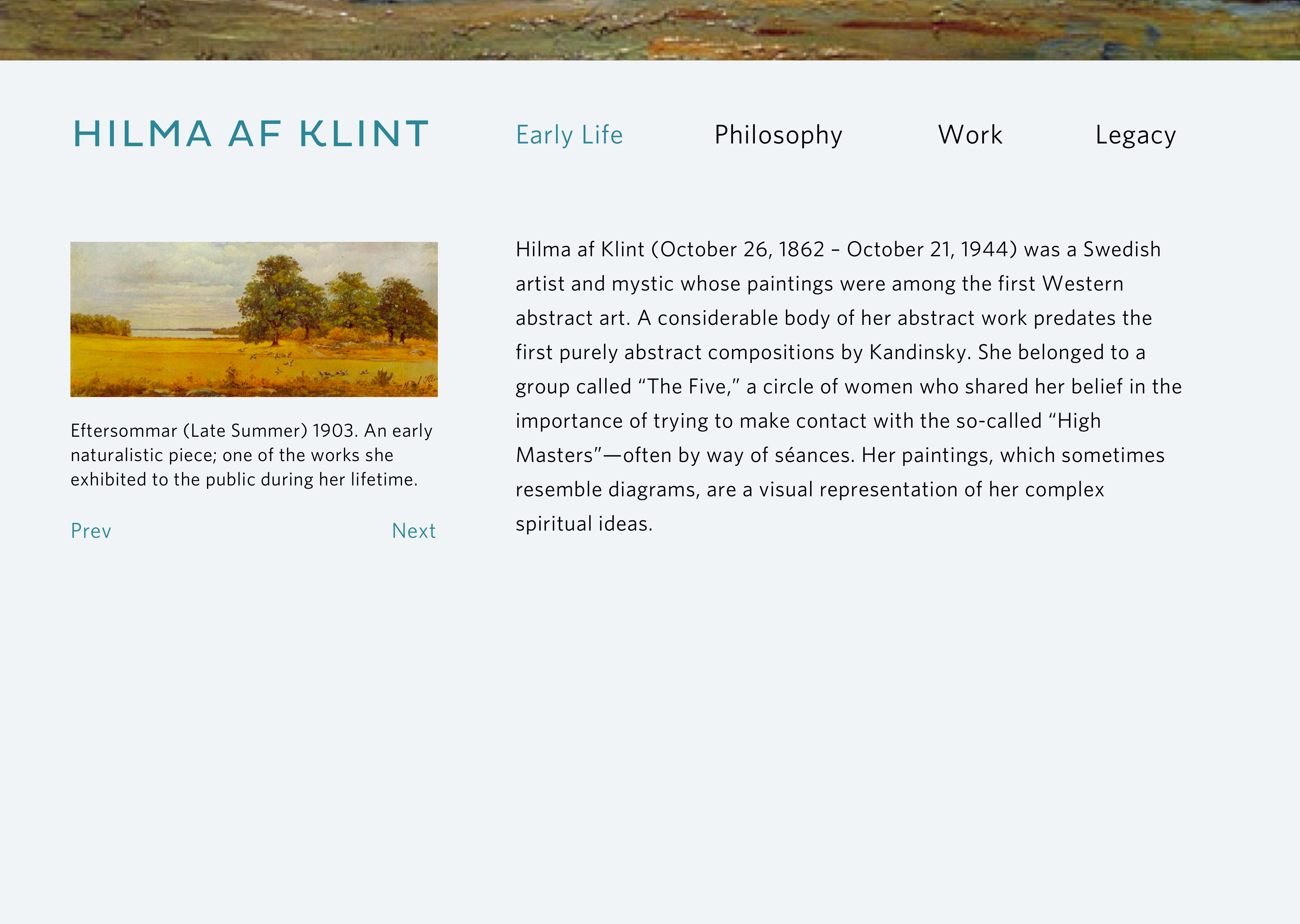
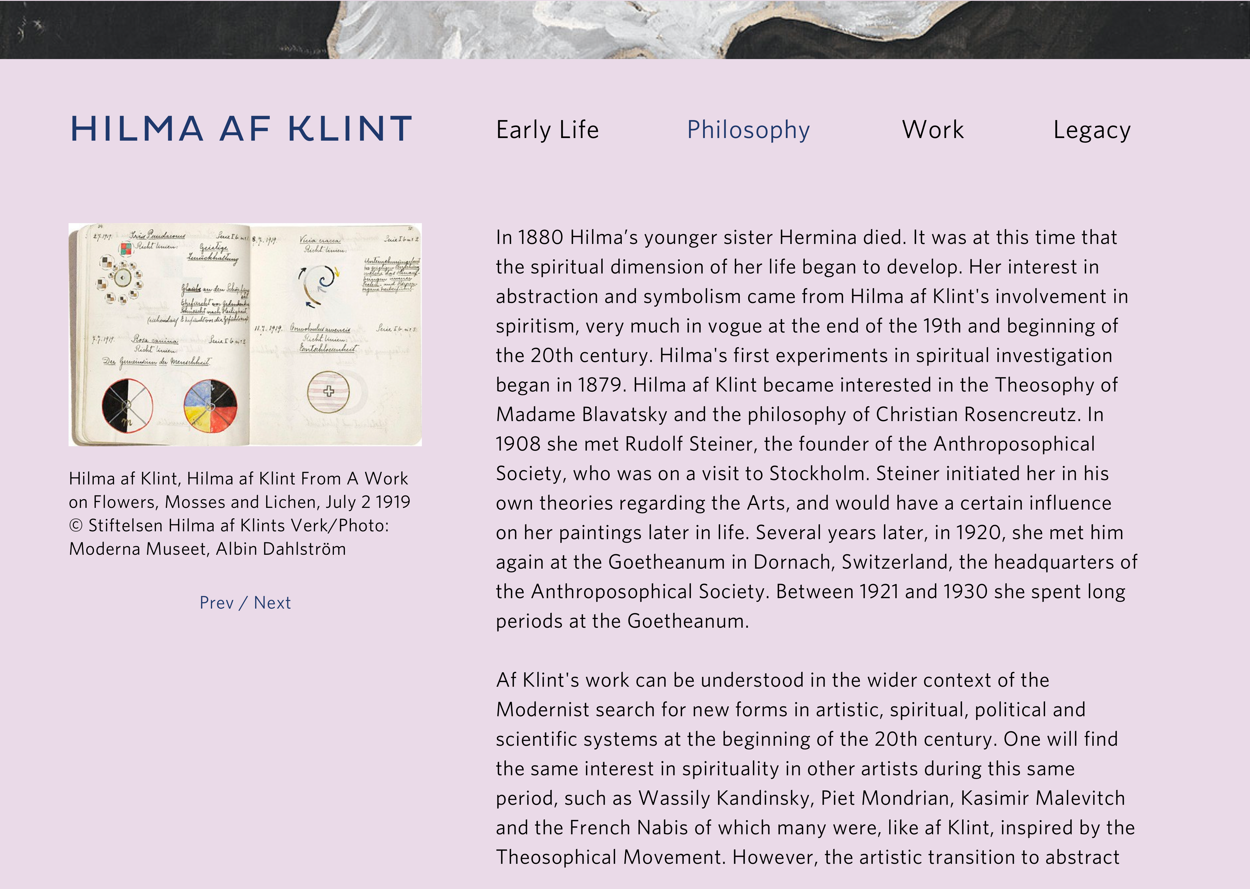
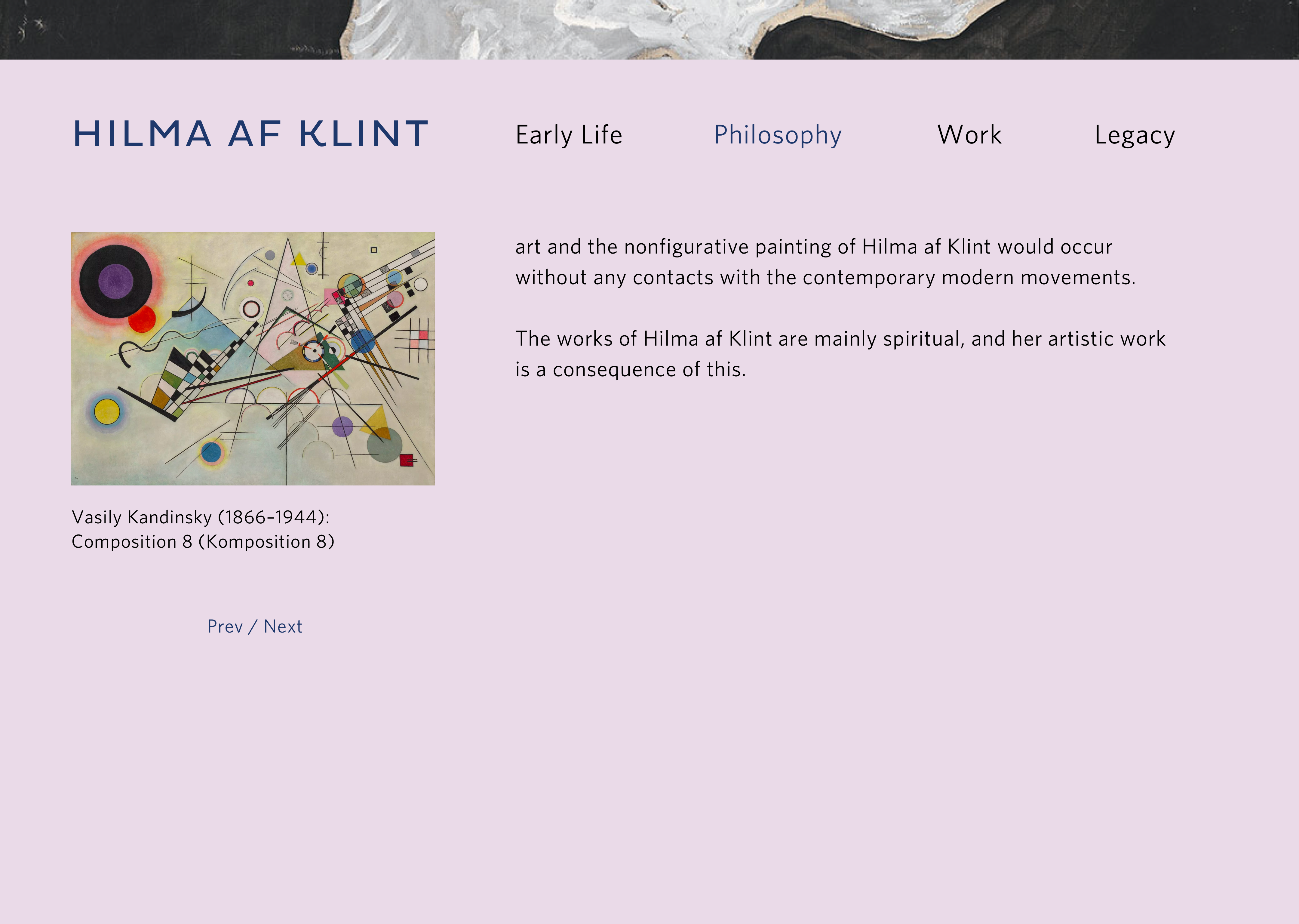
Her strong beliefs in mysticism and spirituality. Maybe some ominous backgrounds.
The header painting is "Swans." I'll swap this out for another black/white painting that looks less distracting when zoomed in. Not sure about the purple background. I think this page looks UGLY! Also tried out a different way to show the "Prev" and "Next" buttons for images.
Directions from Alec:
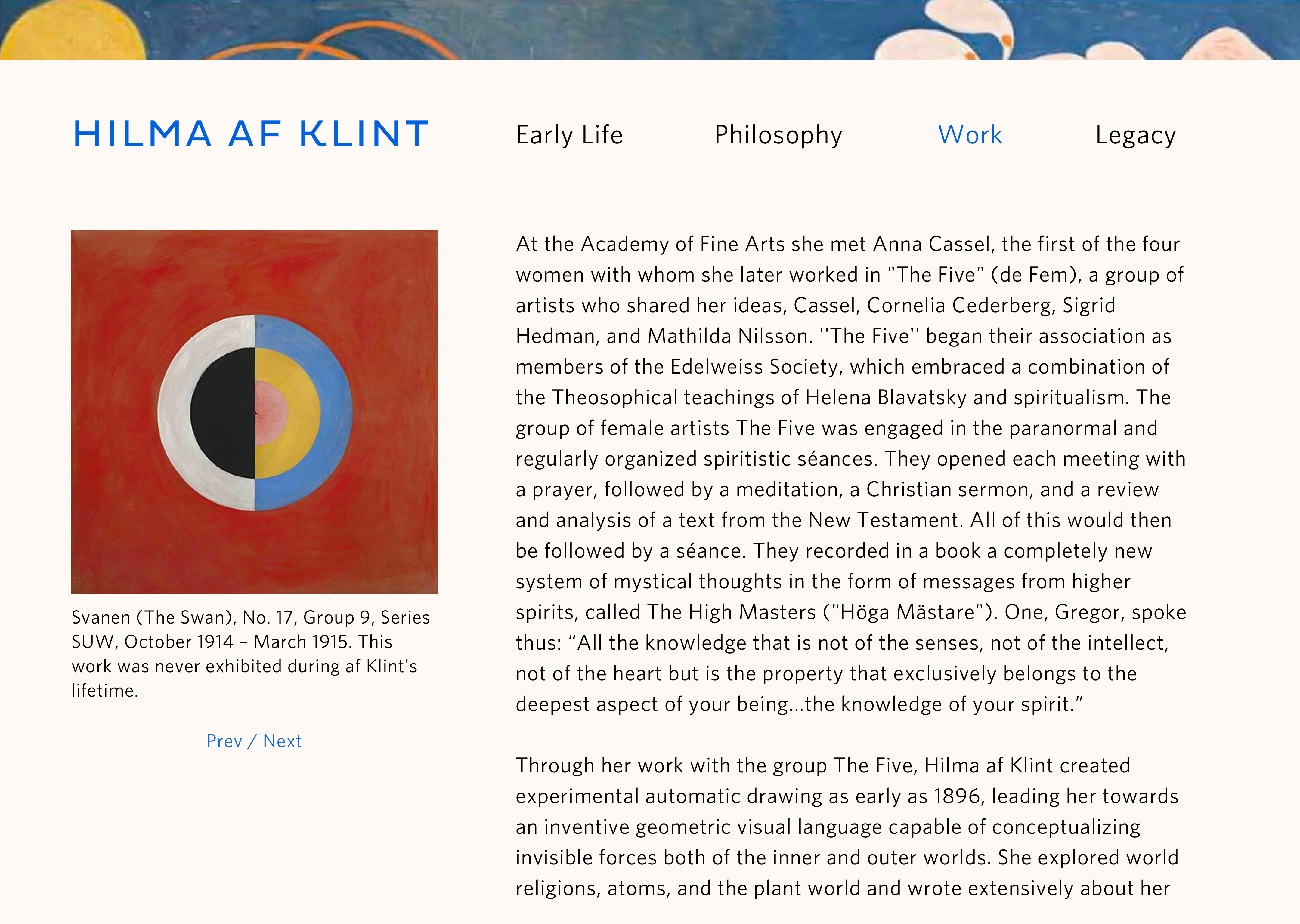
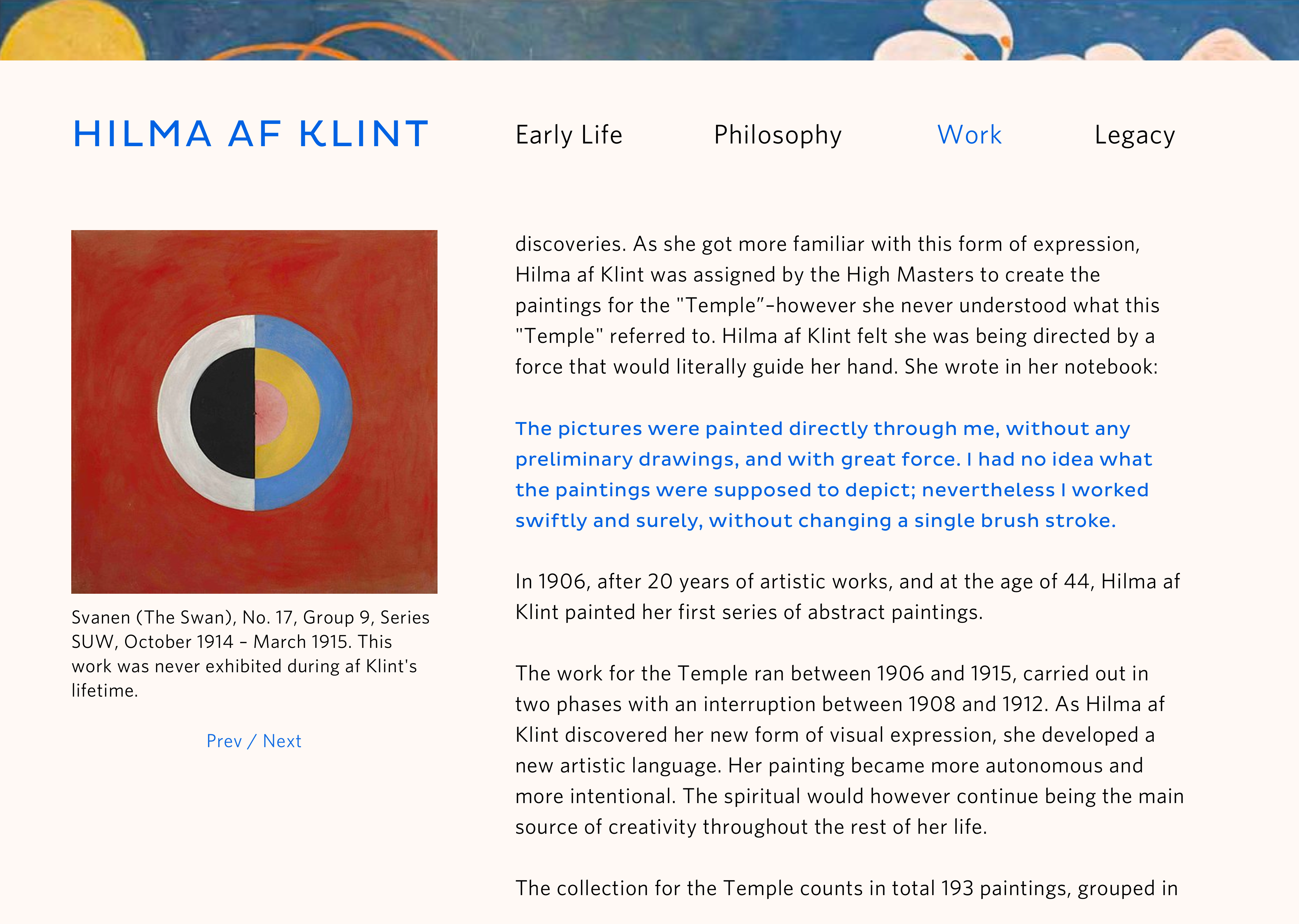
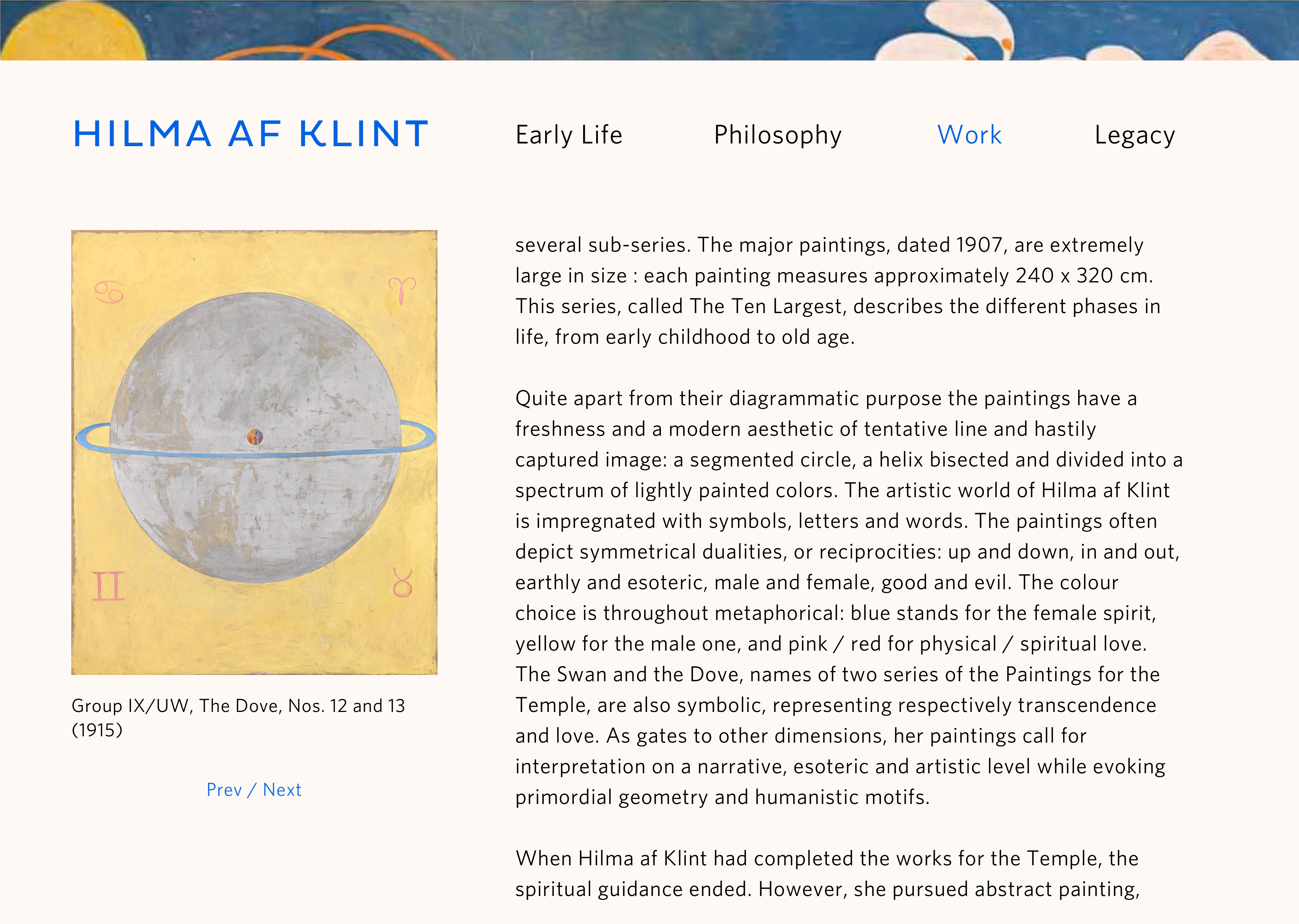
Images of her work. Would make sense to match the colors of the type and backgrounds to her artwork. She used a lot of the same color schemes consistently.
This page has a lot of text. Will probably pare that down or find a better way to break it up.

Directions from Alec:
Can have muted color palette.
Discusses Hilma post-mortem and what happened to her work. Her legacy as an artist.
Images will be from her recent exhibitions. I'll definitely add more info about how Hilma DESERVES/DESERVED MORE ATTENTION!
I could include articles about her like this, this, this, this, and this.
